

Colour advice
How to choose a prom dress colour
A practical way to compare prom dress colours using mood, fabric, lighting and personal preference instead of restrictive colour rules.
Colour is often the first detail you notice in a prom dress, but choosing one does not require a strict seasonal palette or a rule about what you should wear. The most useful choice is a colour that creates the mood you want and still feels like you in person.
In this guide
Begin with the feeling you want
Think about the overall impression you want the dress to have. Deep shades can feel dramatic, bright colours can bring energy and softer tones can create a lighter mood. These are starting points rather than fixed meanings, because silhouette, fabric and detail will change the effect.
Look at colours you already enjoy wearing, but do not let your everyday wardrobe limit the search. Prom is an opportunity to try a shade that feels more expressive than your usual choices while still feeling recognisably yours.
Save several dresses before narrowing the palette. You may discover that the quality you like is not one exact colour but a family of rich jewel tones, soft pastels or clean neutrals.
- Browse prom dresses by colour
Compare the colours currently represented in the collection.
Colour on screen and in real life
Use photographs to shortlist
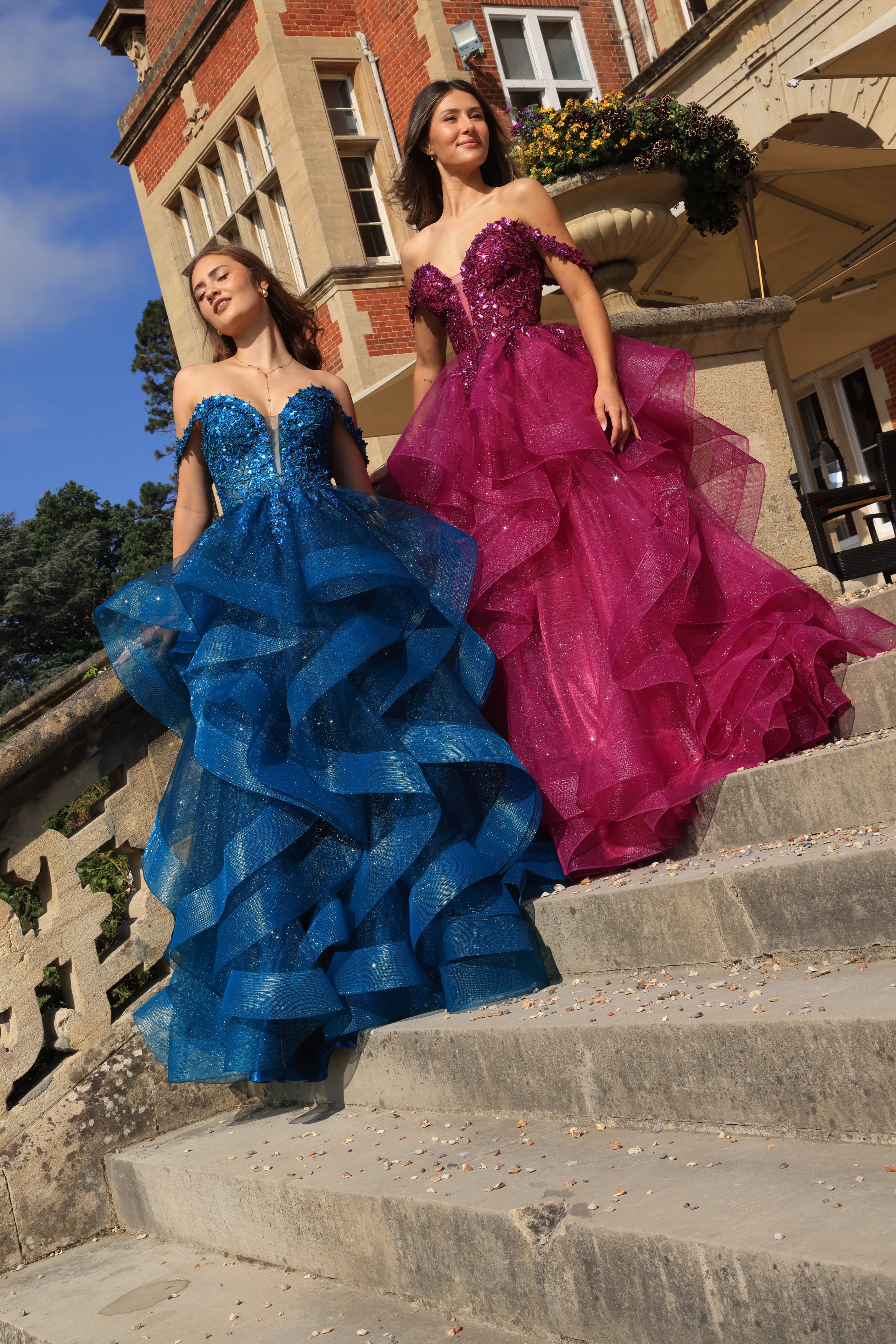
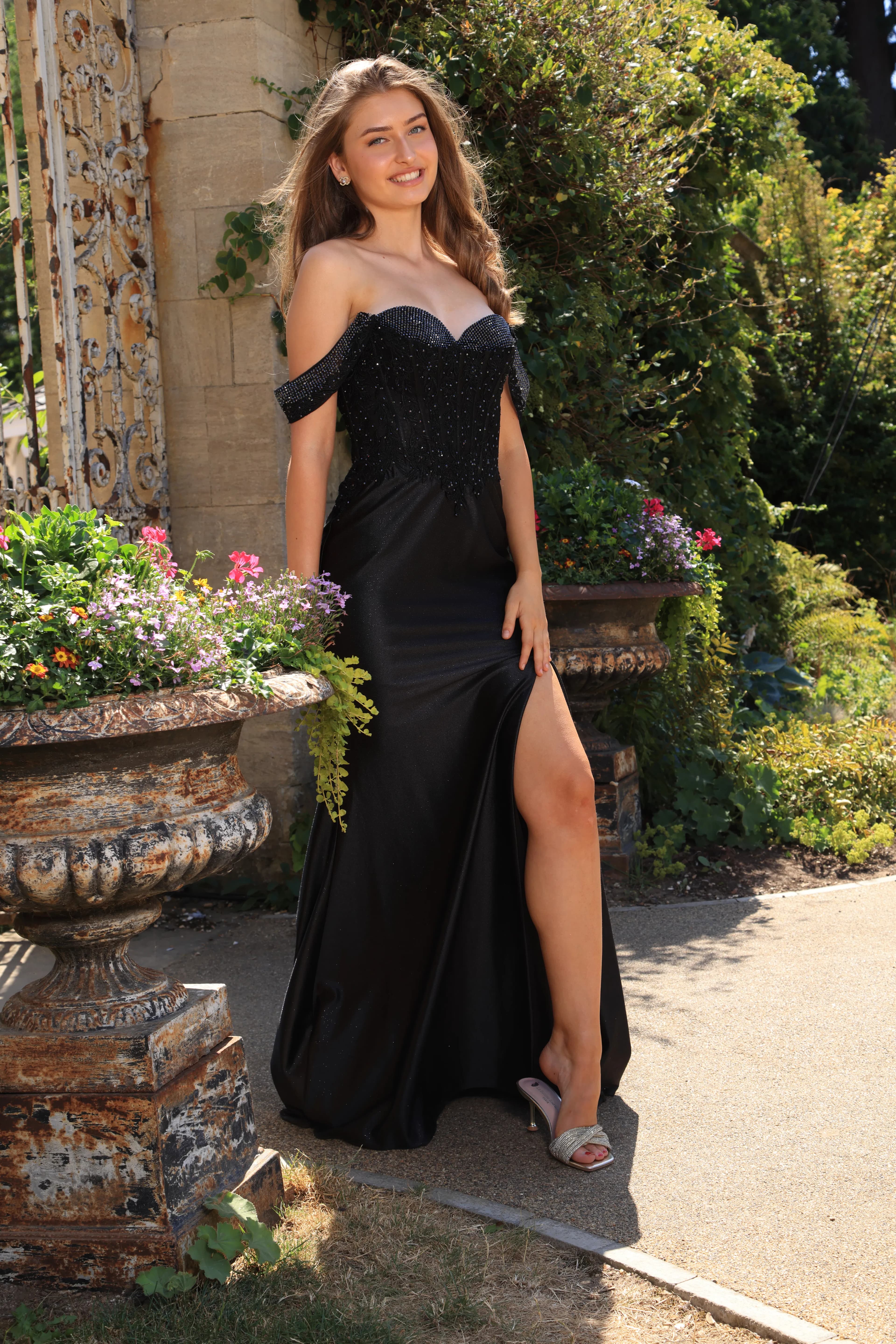
Online photographs are useful for spotting colour families and comparing designs. Screen brightness, editing and the light used for photography can all affect how a shade appears, so treat the image as a guide rather than an exact colour sample.
If a dress appears in more than one photograph, compare them together. This can reveal how reflective fabric, layers or embellishment respond to changing light.
Use the fitting to decide
In person, look at the dress from a comfortable distance as well as close to the mirror. Notice the colour near your face, across the complete silhouette and while you move.
A shade can become lighter, deeper or more dimensional as the fabric folds. Give your eyes time to adjust before deciding that it is different from what you expected online.
How to compare colours clearly
Compare similar silhouettes
When possible, look at two colours in related dress shapes so the volume or cut does not dominate the comparison.
Notice the fabric finish
Matt fabric, satin, tulle and embellishment reflect light differently. The finish may be as important as the colour name.
Step away from the mirror
A full-length view helps you understand the balance of colour across the whole dress rather than judging only the bodice.
Take your own reaction seriously
Advice can be helpful, but the right colour should support how you want to feel rather than satisfy someone else's rule.
Coordinate without overmatching
Your dress does not need to match every part of the event. If you want to coordinate with a partner, flowers or accessories, choose a broad colour relationship rather than trying to reproduce one exact shade across different materials.
Neutral metallic or tonal accessories can support the dress without competing with it. A simpler approach also leaves room for the colour of the dress to remain the main visual decision.
If the event has a theme or dress guidance, confirm what it actually requires before changing a colour you love. Inspiration is useful, but it should not make the outfit feel like a costume.
Prom dress colour questions
Which prom dress colour suits me?
There is no universal rule. Compare colours in person and consider how each shade works with the dress fabric, your preferred mood and how you feel wearing it.
Should my prom dress match my skin undertone?
Undertone guidance can suggest ideas, but it is not a requirement. If you feel confident in a colour, a colour-season label should not rule it out.
What if the colour looks different from the website?
Screens and photography can alter colour. Use online images to make a shortlist, then assess the actual fabric and shade during your appointment.